

San Martín is one of the most recognized bakery brands in Central America, known for delivering a premium in-store experience.
While the app successfully fulfills its primary purpose of allowing users to browse products and place orders, the overall experience presents opportunities for improvement. Navigation can feel overwhelming, visual hierarchy lacks clarity, and the interface doesn't consistently communicate the warmth and premium identity that customers associate with San Martín.
This self-initiated redesign explores how a more intuitive information architecture, refined visual hierarchy, and a refreshed interface can create a digital experience that feels as thoughtful and welcoming as visiting a San Martín bakery.
This self-initiated redesign explores how a more intuitive information architecture, refined visual hierarchy, and a refreshed interface can create a digital experience that feels as thoughtful and welcoming as visiting a San Martín bakery.
This self-initiated redesign explores how a more intuitive information architecture, refined visual hierarchy, and a refreshed interface can create a digital experience that feels as thoughtful and welcoming as visiting a San Martín bakery.
San Martin Bakery
San Martin Bakery
San Martin Bakery
UX research, UX Audit, Information Architecture, User Flows, Wireframing, UI Design, Interactive Prototyping, Design System
UX research, UX Audit, Information Architecture, User Flows, Wireframing, UI Design, Interactive Prototyping, Design System
UX research, UX Audit, Information Architecture, User Flows, Wireframing, UI Design, Interactive Prototyping, Design System
3 months
3 months
Solo
Solo
Where I began
Where I began
Where I began
Project Overview
Made for
Made for
Team
My responsabilities
Timeline
San Martín being one of the most recognized bakery brands in Central America, offering a premium in-store experience built around quality products, warm service, and a strong brand identity. As more customers rely on mobile ordering, the app has become an important touchpoint in the overall customer journey.
Although the app successfully enables users to browse products and place orders, several aspects of the experience create unnecessary friction. The information architecture makes it difficult to discover products efficiently, the interface lacks a clear visual hierarchy, and key actions compete for attention, making navigation feel more complex than necessary.
The challenge was to redesign the experience in a way that simplifies navigation, improves product discoverability, and creates a more cohesive interface that better represents San Martín's premium brand experience.
Main Challenge
Context & Challenge
Context & Challenge
Context & Challenge
Identify Problem
Identify Problem
Define
Define
Define
Design
Design
Discovery & Analytical Audit
Discovery & Analytical Audit
Discovery &
Analytical Audit
Concepualization &
Wireframing
Concepualization &
Wireframing
2 weeks
2 weeks
1 month 2 weeks
1 month 2 weeks
1 month
1 month
Design & Porotype
Design & Porotype
Design Process
Design Process


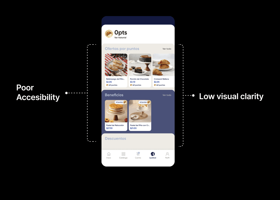
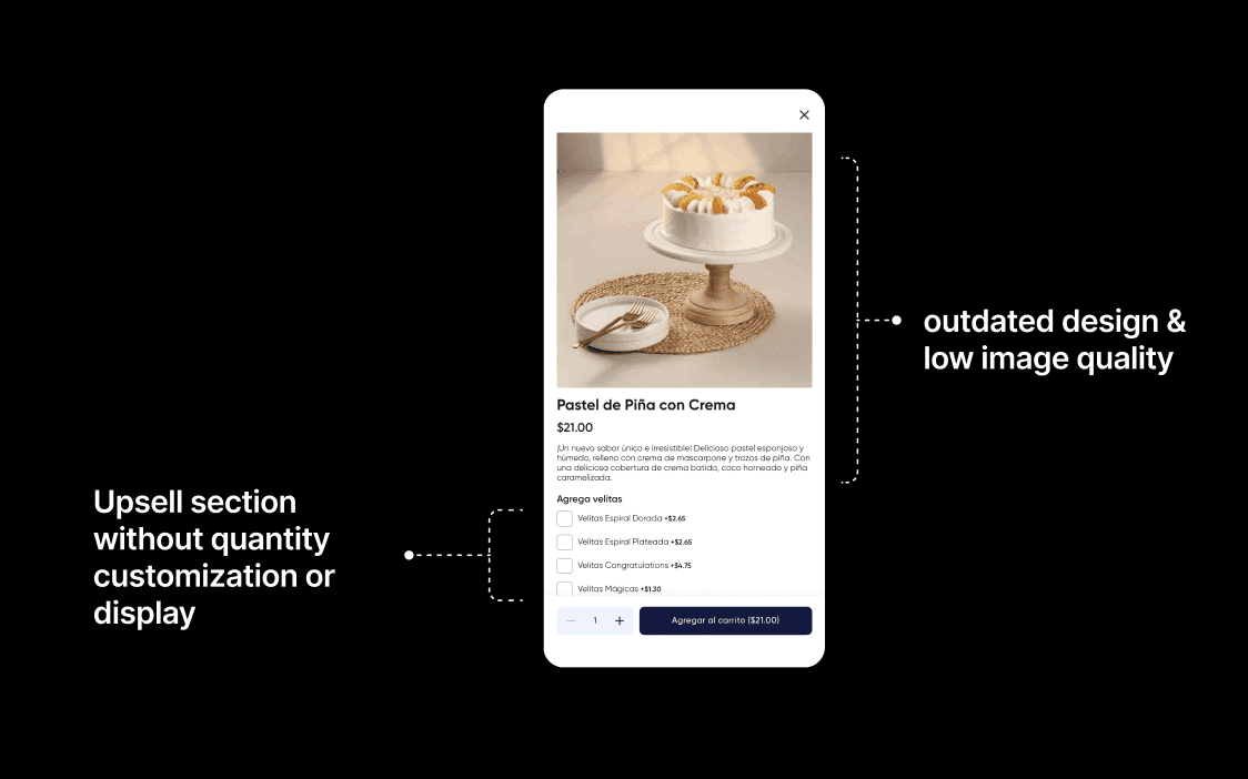


Since the experience was already established, I began by exploring the app and identifying critical friction points where users were likely to encounter usability issues. To better understand these challenges, I conducted a UX audit and heuristic evaluation, analyzing the app's navigation, information architecture, visual hierarchy, and interaction patterns. The findings from this assessment became the foundation for the redesign, helping prioritize improvements that would make the experience more intuitive and aligned with San Martín's premium brand.
Since the experience was already established, I began by exploring the app and identifying critical friction points where users were likely to encounter usability issues. To better understand these challenges, I conducted a UX audit and heuristic evaluation, analyzing the app's navigation, information architecture, visual hierarchy, and interaction patterns. The findings from this assessment became the foundation for the redesign, helping prioritize improvements that would make the experience more intuitive and aligned with San Martín's premium brand.
During the audit, I identified that users struggled with information overload and an unclear visual hierarchy, creating unnecessary friction that often led them to abandon the ordering process. These findings were reinforced by recurring feedback in the App Store reviews, where users expressed frustration with the overall ordering experience.
During the audit, I identified that users struggled with information overload and an unclear visual hierarchy, creating unnecessary friction that often led them to abandon the ordering process. These findings were reinforced by recurring feedback in the App Store reviews, where users expressed frustration with the overall ordering experience.
Identifying the user journey
What was happening?
What was happening?
What was happening?
Grid & Layout

Defining the bases
Defining the bases
Defining the bases
abcdefghijklmnopqrstuvwxyz
abcdefghijklmnopqrstuvwxyz
0123456789
0123456789
ABCDEFGHIJKLMNOPQRSTUVWXYZ
ABCDEFGHIJKLMNOPQRSTUVWXYZ
Satoshi
Satoshi
Satoshi
Regular
Regular
#05244C
#05244C
#FDF6EA
#FDF6EA
#BA9141
#BA9141
#929EA8
#929EA8
Medium
Medium
Bold
Bold
Information Architecture & User Flow
Information Architecture & User Flow


Before redesigning the interface, I focused on rebuilding the app's foundation by redefining its information architecture and mapping the core user flows.
During my UX audit, I found that the existing structure created unnecessary cognitive overload. Information was scattered, navigation lacked a clear hierarchy, and users often struggled to understand where to go next. Combined with feedback from App Store reviews, it became clear that these friction points were interrupting the purchasing journey and causing users to abandon their orders.
To address the matter, I mapped the end-to-end purchase flow and reorganized the information architecture around users' mental models rather than the existing system. This helped simplify navigation, eliminate unnecessary decision points, and create a more intuitive path from product discovery to checkout.
With a stronger structural foundation in place, the visual redesign could focus on enhancing usability instead of compensating for underlying UX issues.
Typography and Color were chosen to create visual hierarchy, direct the eye, improve readability and maintain brand consistency.
Typography and Color were chosen to create visual hierarchy, direct the eye, improve readability and maintain brand consistency.
Typography & Color
Typography & Color
Grid & Layout
abcdefghijklmnopqrstuvwxyz
0123456789
ABCDEFGHIJKLMNOPQRSTUVWXYZ
#05244C
#FDF6EA
#BA9141
#929EA8
Medium
Regular
Bold


Wireframes
Wireframes
The wireframes were intentionally designed to bridge the gap between the in-store bakery experience and the mobile app, creating a visual language that better reflects the San Martín brand. By establishing a clear and consistent foundation, the UI could then be built as a clean, functional, and intuitive experience.
The wireframes were intentionally designed to bridge the gap between the in-store bakery experience and the mobile app, creating a visual language that better reflects the San Martín brand. By establishing a clear and consistent foundation, the UI could then be built as a clean, functional, and intuitive experience.

Before
After
Before
After
Before
After
Before
After
Before
After
Before
After
https://www.figma.com/proto/a12bArokxStyUgaFai8u36/San-Martin-Redesign?node-id=754-1652&viewport=65%2C952%2C0.19&t=2zNvVzNWMPTobTuY-1&scaling=scale-down&content-scaling=fixed&starting-point-node-id=750%3A2411&page-id=44%3A285

For the past four years, I’ve worked across B2B and B2C projects, uncovering user needs and translating them into practical solutions using Design Thinking.
For the past four years, I’ve worked across B2B and B2C projects, uncovering user needs and translating them into practical solutions using Design Thinking.


